Data visualization contributes to statistical analysis.
Data visualization is the result of converting quantitative information into a graph or other expression of a visual language . In this way, it contributes to promoting the understanding of the contents.
The concept alludes to both the process and consequences of this transformation and the interdisciplinary area that makes its development possible. In this sense, data visualization is also a field of study .
Introduction to data visualization
Data visualization is a communicative resource that acquires great importance when attempting to graphically represent large amounts of information. That is why it is especially relevant when working with big data or with certain types of time series.
It can be indicated that data visualization involves a projection of figures into images . Through a mapping , the attributes of graphic elements change by virtue of the numbers.
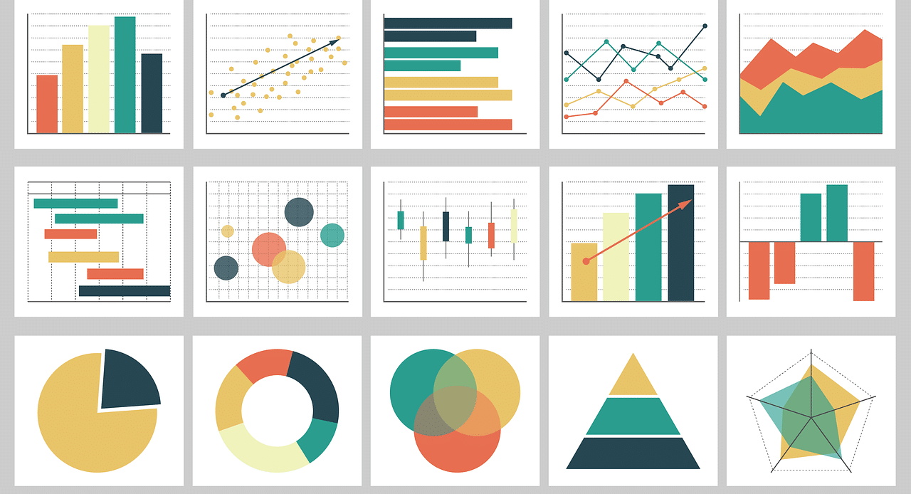
Information visualization can be done using line charts , bar charts , pie charts , or other types of charts. In the digital field, interactive reports can even be created or a 3D visualization developed.
Suppose you want to show how the average salary of a country evolved over a year . Through an infographic , a bar corresponding to the average salary for each month can be presented: if in January said salary was $200 and in February, $190 , the January bar will be larger than the February one.
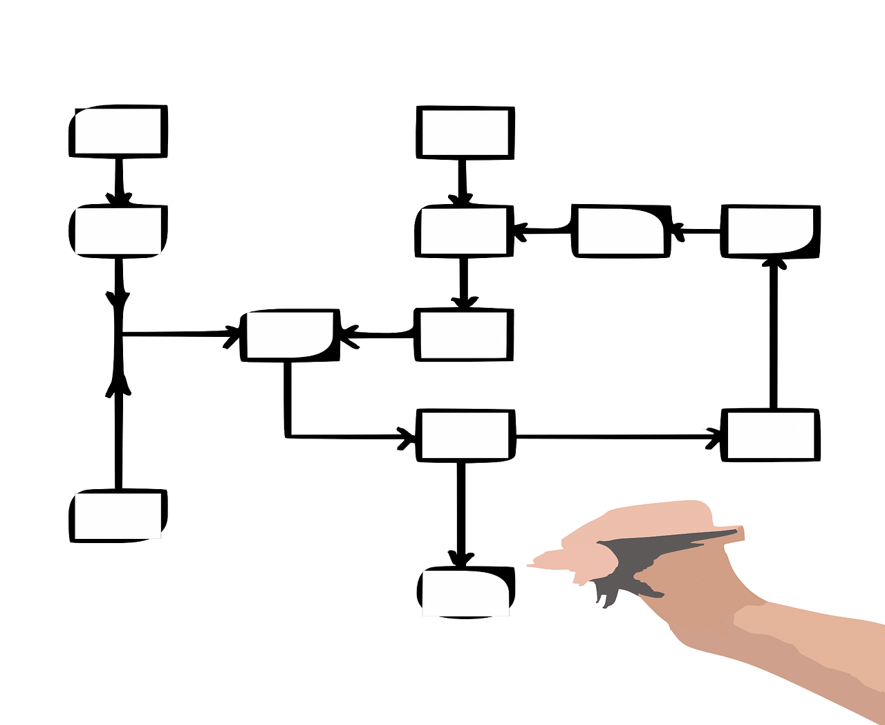
Flowcharts allow the visualization of data linked to processes.
Its importance
The human brain manages to process visual information better than numbers and text. Therefore, when trying to report statistics or trends, using graphs contributes to understanding .
Of course, that graphical representation must be based on real and accurate quantitative data . If dynamic tables are created to compare the performance of two sports teams, for example, but the number of wins and losses of the teams is falsified, data analysis will not provide valid insights.
What graphs do, as long as they are built with true figures, is contribute to the understanding and management of information . For this, the images have to be attractive and generate a connection with the reader.
In short, the visualization of data through a visual representation contributes to the exhibition of correlations and patterns . If we try to show these associations or patterns only through numbers and words, they may be ignored or not understood.
The visualization of health data is essential for the development of health policies.
What to take into account to optimize data visualization
Data visualization experts usually give a series of recommendations so that the use of visual resources is successful. As a starting point, it is essential to choose the appropriate format for the representation .
If the intention is to show in a graph the founding date of the different cities of a province, the logical thing is to create a timeline or perhaps resort to a line graph, but it does not make sense to develop a circular or pie graph because because said diagram does not help to appreciate and compare that type of information .
That the data is easily visible and that the visual components are simple are other suggestions from specialists. In all cases, the aim is to facilitate access to data and promote understanding .
Another issue to consider is context . It is necessary that the graph be understood in a certain framework and that it be possible to relate its data with other information that appears on the same page or publication, generally throughout a text.
The organization of information
Visualizing data using graphic resources, in short, means organizing the information visually in a certain way. Before choosing a specific format ( bar chart , heat maps , scatter plot , word cloud , etc.), you should think about the appropriate way to arrange the data.
The organization of data can be geospatial, hierarchical, temporal or network. We speak of a geospatial organization to refer to those graphics that reflect a sense of space and that serve above all for the description of a region or a geographical area.
When data is arranged hierarchically in the image, a vertical relationship is established between them. If the links are connections in different directions, a network visualization is used.
The temporal visualization , finally, allows the graph to show changes throughout history or a specific period.
Data visualization tools
There are multiple data visualization tools , both free and paid. Some applications enable interactive viewing and even real-time viewing as information is loaded.
Tableau, Power BI de Microsoft, Google Charts, QlikView, Grafana y Kibana están entre los programas y servicios que, cada uno con sus particularidades, hacen posible la visualización de bases de datos.
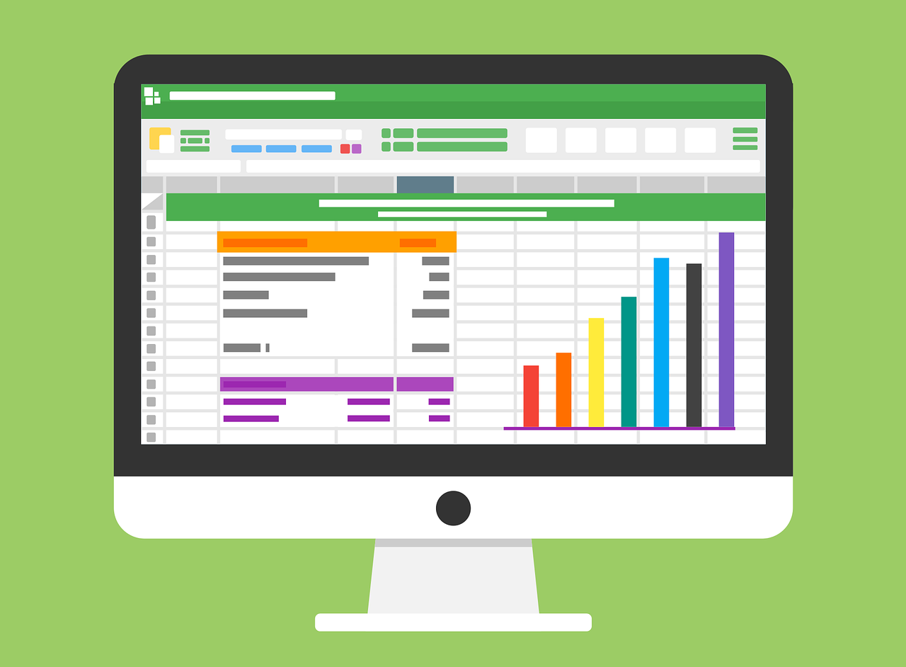
Beyond specialized software, one of the most popular options for visualizing data is Microsoft Excel . You can enter numerical data into your spreadsheets and then export them in graphs with different characteristics.