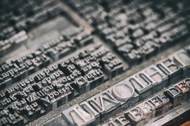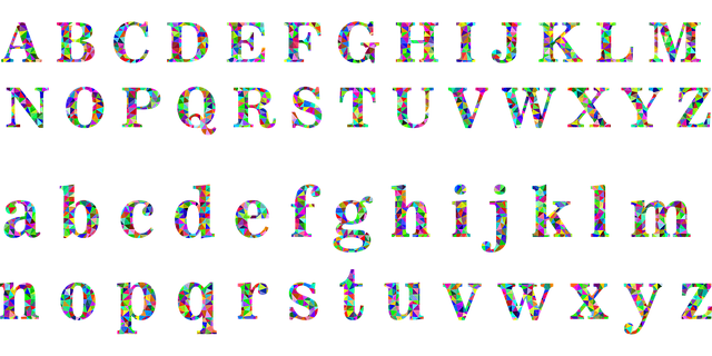
Typography is associated with the design, choice and use of type.
Do you know the etymological origin of the word typography ? If not, and before entering fully into the analysis of the meaning of the term, it is important that you know that it is found in Greek. Specifically, this word comes from the union of three components: the word types which means "mold", the concept graphos which can be translated as "write or record" and the suffix - ia which is equivalent to "quality or action".
Typography is known as the skill, craft and industry of choosing and using types (letters designed with a unity of style) to develop a printing task. It is an activity that is responsible for everything related to symbols, numbers and letters of content that is printed on physical or digital media.
The design, appearance and dimensions of the types depend on the typography. It is possible to distinguish various branches or divisions in this art, such as creative typography (which explores graphic forms beyond the linguistic purpose of symbols), editing typography (linked to the normative properties of type families), detail typography or microtypography (focused on line spacing, kerning and visual marking) and macrotypography (specializing in the type, style and body of symbols).
Origins of typography
Typography imitated, at first, calligraphy. Over time, the most legible and easy-to-understand types were chosen, a decision also linked to technical advances.
The original movable type was developed by Johannes Gutenberg ( 1398 – 1468 ), although these experiments were already carried out by the Chinese in the 11th century. Gutenberg dedicated himself to engraving the characters in reverse relief on a matrix made of steel and, in 1445 , he managed to create the first printed book in the West (the Bible ).
The aforementioned book is also known as the 42-line Bible, alluding to the number of lines that made up each page.

Typography is linked to the letters, numbers and symbols that are printed.
What are the types
When talking about types, which are each of the existing types of letters or the printing parts that are used to highlight a specific letter or sign, we have to emphasize the fact that they have a series of components that make up what is its anatomy. Thus, for example, they have a height, antlers, an arm, a tail, a certain inclination, finials and even an ear.
In this way, based on this set of elements and many others, the establishment of two type classifications is carried out: historical or by form.
In the case of the first modality mentioned we can say that it is made up of ancient, Egyptian or modern types, among others. Meanwhile, in the second, this set of letters is differentiated based on whether or not they have endings that make it easier or more difficult to read.
Typography techniques
In the 19th century , typography opted for two great techniques: monotype and linotype .
While in monotype each symbol is cast in relief in isolation, in linotype the complete lines are cast separately and, at the end of printing, the whole thing is cast again.
