
There are different design styles to create an infographic, which can present different colors and fonts.
Infographics is a concept that is used to refer to a technique focused on the development of images through a computer (computer). By extension, the image obtained through this procedure is called an infographic.
The term comes from Infographie , a registered trademark. Nowadays infographics are usually used to represent information visually or graphically . It is a very popular resource in newspapers and magazines as support for the texts.
Infographics include linguistic signs and non-linguistic signs . The written words, in this way, are combined with ideograms , pictograms and other resources. The intention is usually to make it easier for the reader to understand the data.
Use of infographics
It can be said that the infographic has a didactic objective . By summarizing or supplementing the text , it is expected to function as a quick access mechanism to the most important information.
At a general level, the most common infographics have a graphic in their center, while text and other drawings are presented in the surroundings. In digital format, they can be interactive.
Suppose that, in the economic section of a newspaper, a report is published on inflation for the last quarter in a country, with details of the products that have undergone the greatest price increase. The medium includes, along with the text, an infographic where the figures are presented through a bar graph and the products are symbolized with images (a sandwich to represent food, a lamp or light bulb as a symbol of the public service rate, etc.).
Annual reports are usually presented with infographics.
Tips to develop it
The first step before delving into the design of an infographic is to clearly define the objectives . It all starts with a problem , understood as a series of obstacles that we must overcome to reach the goal (in this case, communication with the reader).
The audience turns to infographics with the desire to learn something specific and we must strive to achieve this. Starting from the main problem, we have to ask ourselves a series of relevant questions, arranged in a hierarchical pyramid. This will be the skeleton of the infographic, around which we will develop the content .
Having reached this point, we can look for the data to include in the infographic, taking as reference the questions posed above, since the objective is to answer them all. Some people may not need this research step because they know all the information they need; However, it never hurts to compare it to provide a reliable and solid result.
With all this, we can now come up with the design , and this includes several aspects, such as the general aesthetics, the elements that we will use and their organization within the graphic. Data is as important as how we present it. All of this is also closely linked to the type of content and the audience that will consume it. For example, normally the terms and concepts known to everyone do not require a definition, as do the technical or less common ones; However, if the audience is only highly trained professionals in a specific area, we can probably overlook it.
Regarding the way in which we present the data , there are certain resources that enhance the impact they produce on the public, such as comparative tables . It is more difficult to remember an isolated value than a comparison in which two or more are contrasted, especially if at least one of them is more everyday. Patterns and groups also come into this framework because the association of concepts also makes it easier for us to memorize thanks to the fact that the relationships between them come into play and this makes them more tangible.
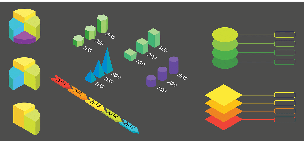
Pie charts can add value to an infographic.
Usefulness of infographics
To facilitate the visualization of data , in short, the graphic design (illustrations, bar graphs, maps, diagrams, etc.) and the typography to be used must be considered. Software and design tools such as Photoshop , Canva , Illustrator , Venngage and Piktochart facilitate this task.
In this data presentation, close attention must be paid to information design. Visual storytelling is key to contributing to access to and understanding of content .
These characteristics make infographics very useful in the educational field and in the media. In digital publications, interactive infographics are highly appreciated. In this framework , 3D infographics and animated infographics also stand out. If we focus on newspapers, magazines and printed books, the publication of infographics inevitably has other features.
Demographic data, for example, are usually captured in statistics infographics . The same goes for economic data. Sometimes, infographic tutorials are even developed since there is confidence in the didactic or pedagogical value of this resource.
It can be said that what infographics allow is to disseminate information by combining texts, figures and graphics, which helps the reader understand what is captured.