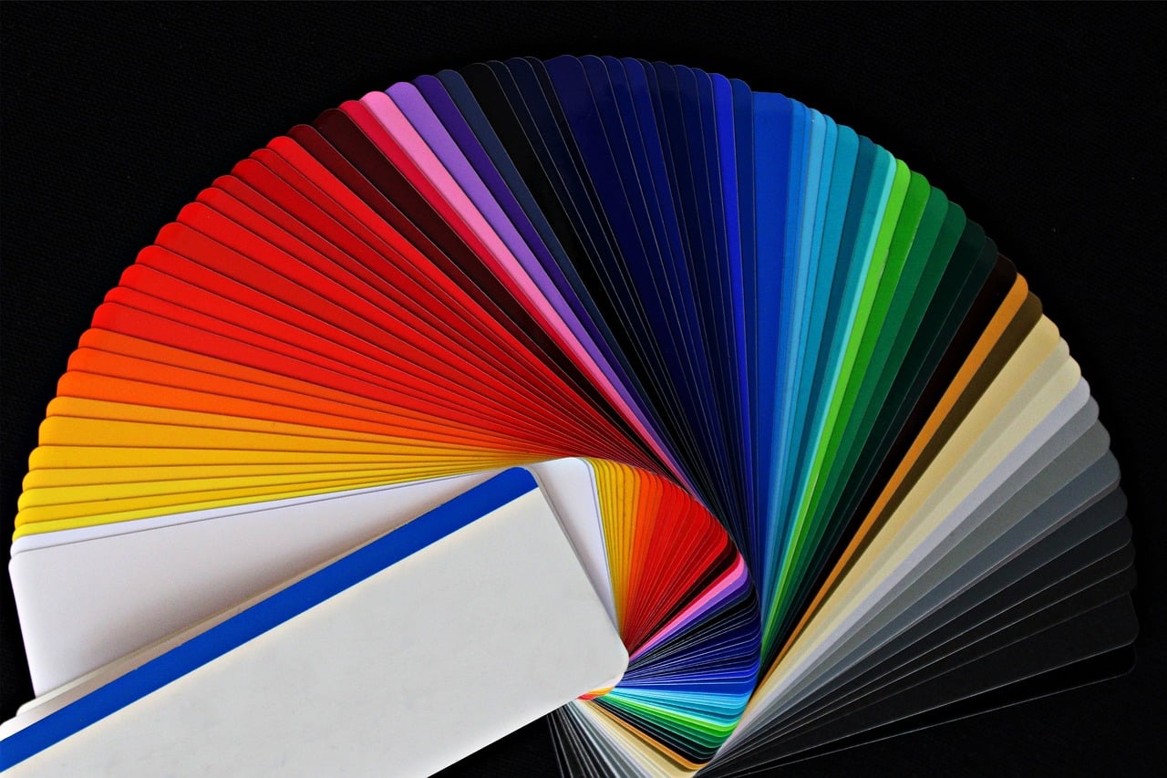
Colors that are within the visible spectrum nourish the color wheel, a very useful graphic tool to enhance artistic disciplines and obtain excellent design results.
The color wheel is a structure also called a color wheel in which, in a circular manner and organized according to tone or hue , the primary colors and the tones that derive from them are reflected.
It is a very old resource that organizes the colorations and ranges that can be detected and appreciated by the human eye in order to serve as a tool for those who dedicate themselves to art and seek to provoke certain effects from the harmony of colors .
Structure of the color wheel
The structure of the color wheel is not random but rather aims to hierarchize categories. Thus, then, the primary colors are displayed first (which stand out for not being the product of a chromatic mixture), then the secondary colors (fruits of the combination of a pair of primary tones) become relevant and, finally, the It gives space to tertiary colors (arising from fusing a primary color with one of the adjacent colors belonging to the secondary tones).
Based on this organization, complementary colors (which are opposite each other on the color wheel) and analogous colors are also recognized (this is how the varieties that are located on the sides of a specific color are considered).
color theory
Color theory is based on basic principles linked to how to combine a pigment or color depending on the effect to be achieved. These regulations promoted by multiple experts on the subject significantly influence the fields of television , painting , printing and graphic design .
Key, in this framework, is the chromatic circle that brings together the colorations of the visible spectrum . The analyzes and tests take into account parameters such as the level of saturation , brightness or luminosity , for example.
It is also interesting to keep in mind that there are different color models . One is RGB (red, green, blue), an additive system focused on primary colors . It is very common in computer monitors, audiovisual projectors and televisions.
The CMYK model (cyan, magenta, yellow, black), meanwhile, has a subtractive root and contemplates the absolute absence of luminosity . In this sense, it takes into account the absorption of light. Given its particularities, it is used for ink-based printing techniques .

Colors are segmented into multiple categories: there are primary, secondary, tertiary, neutral, complementary colors, etc.
Applications of the color wheel
Most applications of the color wheel are basically linked to the creative universe.
As can be deduced from practice, this tool is an excellent ally for those who are dedicated to interior design since it facilitates the choice of tones when adopting a decoration capable of transmitting and provoking certain sensations. It is also an instrument of enormous value for those who are dedicated to graphic design and has a significant impact in the field of fashion because it contributes to achieving harmony when combining garments.
The visual effects achieved with animation works, to detail another possibility, are enhanced when considering the color wheel , which is present in many other manifestations of the field of art, such as painting . Those who paint on multiple surfaces have plenty of painting techniques and styles to choose from. So, there are artists who create magic using watercolor, colored pencils or tempera , others feel more comfortable painting with acrylic and there is no shortage of those who create beautiful paintings with oil paint.
Nor can we overlook the importance that this element has achieved both in the field of cinematography and photography .

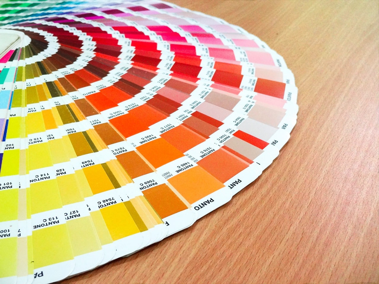
The Pantone color palette refers to a color system promoted by a company with a lot of influence in the graphic arts.
Color Categories
Colors are organized into numerous categories based on their properties, their formation and other particularities.
After having referred to primary, secondary, tertiary, analogous and complementary colors, it is time to add data focused on other types of chromatic options.
It is possible to find, for example, cold colors and warm colors . It is said that the former transmit freshness and concentrate superior energy compared to warm tones, related to a warmth effect.
A low level of saturation and intensity, on the other hand, characterize neutral colors . Within this set there are earth tones, grey, black and white, to name a few as a guide.
In the case of monochromatic colors , the distinctive feature is the existence of a single tone or nuance, having a well-defined base color that does not mix with others. From recognizing luminosity in a chromatic variety but not finding saturation or tone, the theory leads to alluding to achromatic colors . The members of this group, gray, black and white, are often described as colorless colors .
The so-called opposite colors , finally, are identified by being, on the color wheel , one opposite the other. They serve to guarantee the contrast that, in lighting and design, is key in terms of visual perception .
